
T R A D E C O F FE E : R E T U R N I N G U S E R E X P E R I E N C E

Team Members:
Lead Designer: Eve DeAngelis
Product Manager: Pete Jelliffe
Front End Engineers: Derek Kelmanson, Vincent Liu
Back End Engineer: Kenneth Lin
tl;dr
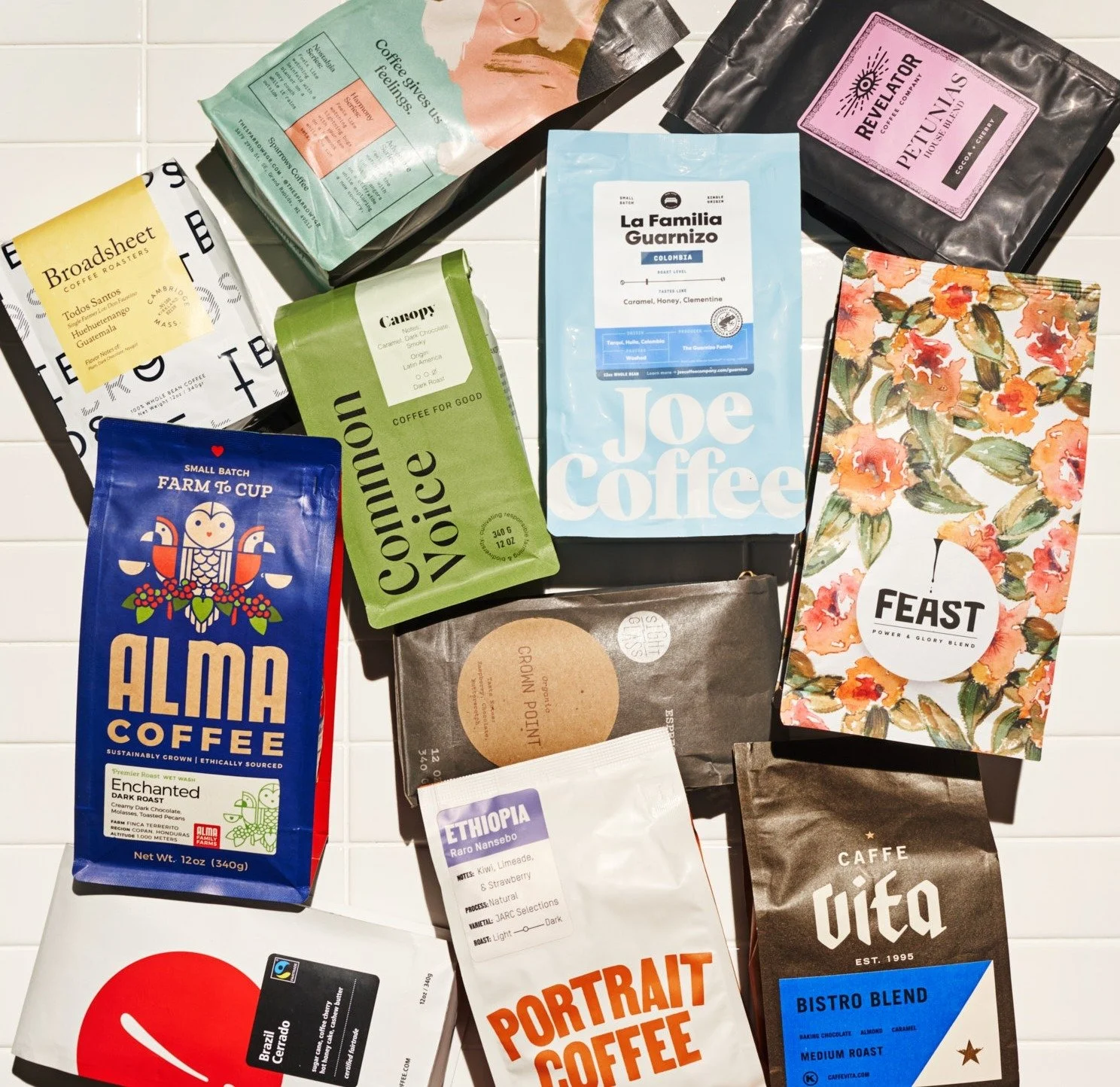
Drinktrade.com is a coffee subscription service that partners with 50 of the best roasters in the US to give its users the opportunity to try more than 400 coffees. In Q1 of 2022, the returning user squad embarked on a complete redesign of the subscriber experience in order to better deliver on our promise of making fantastic coffee easy to discover.
A complete code overhaul by our development team allowed us to deliver highly requested features that weren’t possible in the old paradigm. Over this six month project I conducted in depth design research, overhauled our information architecture, and introduced a more streamlined design system which leads to more efficient builds cohesive user experience. Since its launch in May of 2022, we’ve successfully reactivated over 7,000 users who had previously cancelled their subscription.
Diagnosing The Problem
A buildup of design and tech debt was the impetus for rebuilding the returning user experience. But before jumping into new designs and features, I spent a lot of time understanding how the website flowed when I inherited it. The first thing I did was create a site map (below). This helped me understand the site’s information architecture, and identify potential problems, and my resulting hypotheses.


Additional strategies for understanding how to improve the experience included
Creating user journeys
Combing through NPS survey results
Conducting competitive analysis
Determining the public’s opinion of us through reddit forums and published articles
Our final step before narrowing down our goals was to conduct user interviews and concept testing. With the help of our freelance product designer and my team’s product manager, we met with 8 users over 2 days to learn how we could improve their experience with Trade. Below is a the Figma file we used to take notes throughout interviews and tests, as well as discuss and synthesize our findings. Check out the Appendix at the bottom of this page for the discussion guide!
“The UX/UI for changing beans / rescheduling / choosing delivery intervals can leave a bit to be desired... It’s unclear how to select coffees when recommendations keep overriding selections.”
TRADE 2.0 (Minimum Lovable Product) GOALS
Create a highly personalized dashboard with evergreen content that helps the user understand their subscription at a glance, and feel understood by Trade
Make it easier than ever to swap out our coffee recommendations for the user’s selection — so they get the perfect match every time
Provide clear points of entry for users’ jobs to be done so that their time spent on our website feels simple and efficient
When does my next coffee arrive?
What is my next coffee, and what will it taste like?
I want to receive darker roast coffees. How can I change that?
How can I slow down my delivery frequency? Speed it up?
INFORMATION ARCHITECTURE
In order to move quickly with the rebuild, we needed to determine which sections of the experience were priority. Using our initial goals as a guide, we were able to identify which sections of the site would bring the user to the new app, and which sections of the site could temporarily remain part of the old app. Ultimately, all sections of the logged in user experience will be re-designed and built in the new app — but in order to meet our goals, our initial focus was to design and build a new Dashboard and Coffee Queue.
Blue-sky design iterations:
An important strategy I employed while tackling this project included blue-sky design thinking. Before I inherited this product, product managers, engineers, and management had dreams and aspirations for what features they’d like to implement if given the chance. Early on in my process, I created a design file that I named the “Mobile Playground”. This was a workspace where I could capture the ideas and aspirations of the team with a mobile-first approach, and investigate how they might cohabitate with the "Minimum Lovable Product” goals that we identified.
Some of these dream features included:
Advanced settings: Allowing users to have two totally different sets of taste preferences under a single account (ex: get one decaf and one light roast per order)
Coffee Graphs + Charts: Creating data visualizations that help the user understand their unique coffee profile
Wishlist: Allowing users to save coffees to a shortlist so that they can remember to try it at a later date
This file and overall strategy ended up being incredibly helpful to look back on throughout the re-design and re-build. It helped keep the team honest about our long-term vision for the product, and future-proof features included in our “Minimum Lovable Product” in a way that would allow us to re-visit them in future sprints to bring them closer to our Blue Sky vision.
Prototyping and user testing:
Prototyping and conducting an unmoderated user test of the new dashboard design was an important next step. Putting this early iteration in front of users served as both a usability test and a concept test and taught me:
☺️ Completion of the “jobs to be done” was easy. All users could complete every task!
🥳 The dashboard was hugely successful in helping folks orient themselves within the site; many people navigated back to it between each task.
😕 Certain crosslinks present on the dashboard should be more prominent (for example, the user should easily be able to access their subscription settings from the dashboard)
😁 Interactions like hover states were hugely successful in helping users understand how to edit their queue
USER INTERFACE:

“Your mobile website is excellent! Fast, easy to navigate. Subscription management is much better than others I have experienced. Kudos!”
What i would have done differently
Data: We didn’t have adequate testing or analytics in place to be certain that these features improved high value actions or retention
Dream Features + Delighters: Although we couldn’t have built dream features in their entirety, I would have pushed harder to incorporate “delighters” into the MVP (for example, a light weight version of data visualization)